10 Ecommerce Checkout Page & Shopping Cart Design Best Practices for 2025

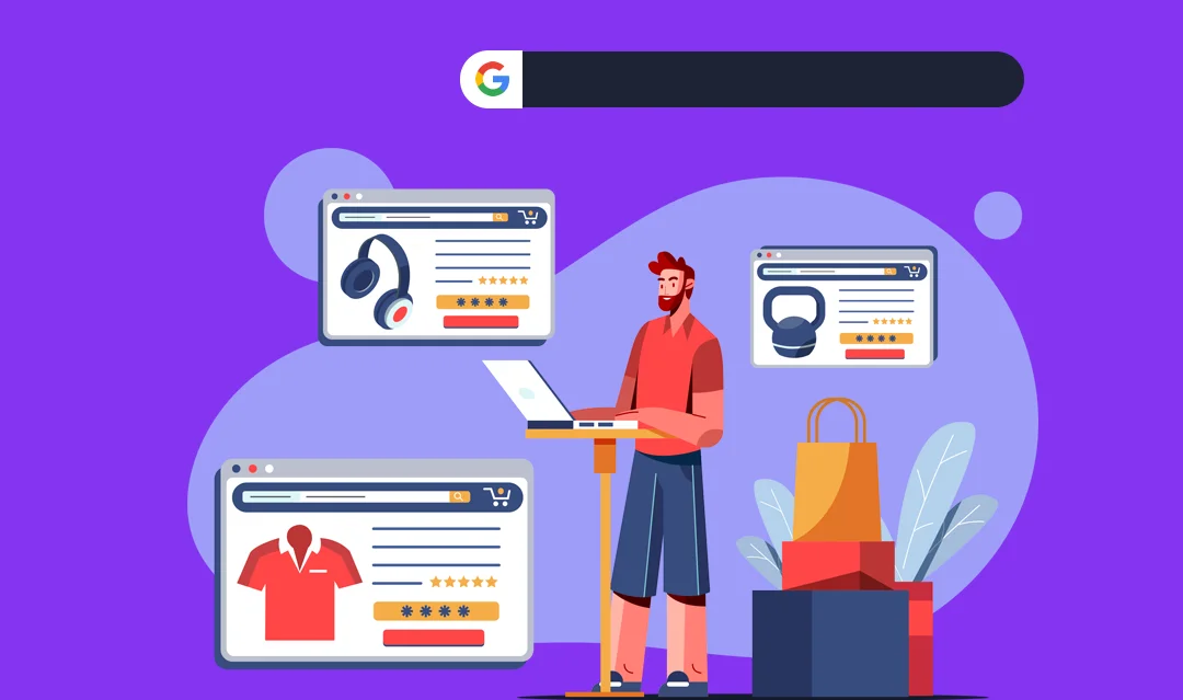
Did you know that a whopping 70% of online shoppers abandon their carts before completing a purchase?
It’s a staggering number, and if you’re running an online store, it directly affects your bottom line. But don’t worry, you’re not alone in this, and there’s a solution at hand.
In this concise guide, you’ll discover the best practices for designing an ecommerce checkout page that converts.
We’ll explore strategies that ensure your customers glide through the checkout process smoothly, significantly reducing cart abandonment rates.
Why is this important, you ask? Well, a seamless checkout experience directly translates to happy customers and more sales.
And let’s face it, in the competitive world of ecommerce, you need every advantage you can get.
Have you ever found yourself frustrated at a confusing or time-consuming checkout process? We’ve all been there, and it’s a concern that many online shoppers share. That’s exactly what we’re addressing in this article.
So, are you ready to turn those abandoned carts into successful transactions?
Let’s get started and unlock the full potential of your ecommerce checkout page. Welcome aboard, this is going to be a game changer for your online store!
What is Checkout Page Optimization?
Checkout page optimization is a crucial aspect of your ecommerce strategy, aiming to streamline the purchasing process, making it as smooth and hassle-free as possible for your customers.
It involves tweaking various elements on your checkout page, from the design and layout to the text and functionality, ensuring everything is geared towards guiding the customer seamlessly from their shopping cart to the completion of their purchase.
Imagine walking into a store, items in hand, ready to make a purchase, only to find a long, confusing line at the checkout counter.
Frustrating, right? That’s exactly the scenario we want to avoid in the online world.
Checkout page optimization is about creating a virtual express lane for your customers, ensuring they can breeze through the payment process, smiling all the way.
Why is Checkout Page Optimization Important?
In the digital realm, the checkout page is your final hurdle, the last step before a browsing visitor transforms into a paying customer.
And in 2025, with the ecommerce world more competitive than ever, you can’t afford to overlook this critical part of the customer journey.
A well-optimized checkout page does wonders for your conversion rates, turning potential cart abandonments into successful transactions.
It’s about building trust, minimizing distractions, and providing a clear, straightforward path to purchase.
When customers feel confident and in control, they’re more likely to complete their purchase, boosting your sales and your bottom line.
What is Checkout Abandonment?
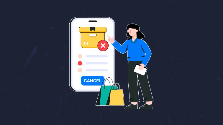
Checkout abandonment is the phenomenon where a potential buyer, after adding products to their cart, leaves the website without completing the purchase.
It’s the online equivalent of walking out of a store without buying anything, and it’s a challenge that every ecommerce store faces.
But here’s the kicker: while some cart abandonment is inevitable (hey, we all get distracted sometimes), a significant portion of it is preventable.
By understanding the why behind checkout abandonment, you can take proactive steps to address the issues, turning potential lost sales into happy customers.
Why Does Checkout Abandonment Occur?
There are myriad reasons why a customer might abandon their cart, ranging from technical issues to second thoughts about the purchase. However, many of these issues can be traced back to the checkout experience itself.
Perhaps the checkout process is too long or complicated, asking for too much information or requiring too many steps.
Maybe there are unexpected costs, like high shipping fees or taxes, that catch the customer off guard. Or it could be that the customer doesn’t feel secure providing their payment information, due to a lack of trust signals on the page.
By diving deep into the reasons behind checkout abandonment, and addressing them head-on through optimization, you can create a frictionless experience that encourages customers to complete their purchase, rather than heading for the virtual door.
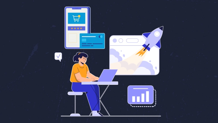
Now that we’ve laid the groundwork, let’s delve into the strategies and best practices that will transform your checkout page into a conversion powerhouse. Stay tuned, because this is where the magic happens!
10 Best Practices to Perfect Ecommerce Checkout

1. Allow Guest Checkout to Reduce Cart Abandonment
In 2025, the trend continues where customers prefer a quick and hassle-free checkout process. Allowing guest checkout caters to this need, significantly reducing cart abandonment rates.
A study shows that forcing users to create an account is one of the top reasons for cart abandonment. By providing a guest checkout option, you’re removing a major barrier, encouraging more users to complete their purchase.
2. Limit Distractions During Checkout
Keep the checkout page clean and free from distractions. This is not the place for upsells or additional product recommendations.
Any unnecessary content or links can divert the customer’s attention and lead them away from completing the purchase. Focus on creating a streamlined process that guides the user seamlessly from one step to the next.
3. Offer Multiple Payment and Shipping Options
Customers have their preferences when it comes to payment and shipping. Providing a variety of options ensures that you cater to a broader audience.
Include popular payment methods like credit cards, PayPal, and other digital wallets. For shipping, offer different price points and delivery times, allowing customers to choose what works best for them.
Read More: Top 7 Payment Gateways for Your Ecommerce Website
4. Prioritize Mobile-Friendly Design
With over half of online shopping done via mobile devices, a mobile-optimized checkout process is non-negotiable.
Ensure that your checkout page is responsive, with large buttons and form fields that are easy to navigate on smaller screens.
A mobile-friendly design not only improves user experience but also positively impacts your search engine rankings.
5. Add a Progress Indicator
A progress indicator provides clarity on how many steps are involved in the checkout process and how far along the customer is.
This transparency helps reduce anxiety and gives users a sense of control, leading to a higher likelihood of purchase completion. Make sure the progress indicator is visible and easy to understand.
6. Display Trust Signals and Badges
Trust is a critical factor in online transactions. Displaying security badges, customer testimonials, and money-back guarantees can significantly enhance trust.
Ensure that these trust signals are prominently placed, especially near payment information fields. This reassures customers that their personal and financial information is secure.
7. Offer a One-Page Checkout
A one-page checkout condenses the entire process onto a single page, reducing the number of steps required to complete a purchase.
This approach can lead to quicker checkout times and a smoother user experience. However, ensure that the page doesn’t appear cluttered and that each section is clearly delineated.
8. Present an Exit Intent Popup
Exit intent popups can be a last-ditch effort to convert a potential abandoner. When a user shows signs of leaving the checkout page, present a popup with a compelling message or offer to encourage them to stay and complete their purchase.
Be careful not to be too intrusive, as this can have the opposite effect.
9. Avoid Unexpected Charges for Customers
Transparency is key when it comes to pricing. Unexpected charges, such as shipping fees or taxes added at the last minute, are a common cause of cart abandonment.
Clearly communicate all costs upfront, and consider offering free shipping or a flat rate to eliminate surprises.
10. Use Autofill and Data Validation
Autofill helps speed up the checkout process by automatically filling in known information, while data validation ensures that all entered information is correct.
These features reduce the likelihood of errors and the frustration associated with them, leading to a smoother checkout experience and higher conversion rates.
By implementing these best practices, you’re setting the stage for a frictionless checkout experience that not only boosts your conversion rates but also leaves a positive lasting impression on your customers.
Remember, a happy customer is a returning customer, and in the world of ecommerce, that’s gold.
Conclusion:
In wrapping up this comprehensive guide, it’s crucial to revisit the essence of our discussion: transforming your ecommerce checkout page into a conversion powerhouse.
We’ve navigated through the intricacies of checkout page optimization, understanding its pivotal role in reducing cart abandonment and enhancing the overall shopping experience.
From allowing guest checkouts to prioritizing a mobile-friendly design, we’ve dissected the top strategies that stand out in 2025-26, ensuring your ecommerce platform is not just keeping up with the times, but setting the pace.
We emphasized the importance of a seamless checkout experience, highlighting how it translates to satisfied customers and, ultimately, a healthier bottom line.
Now, it’s over to you. Have you identified areas in your checkout process that need a tweak or a total overhaul?
Are there practices mentioned that you’re eager to implement? Remember, every change, no matter how small, can lead to significant improvements in your conversion rates and customer satisfaction.
We’re eager to hear your thoughts and experiences! Share your journey towards optimizing your checkout page, the challenges you’ve faced, and the victories you’ve celebrated.
And if you’re looking for more insights and strategies to elevate your ecommerce game, don’t hesitate to check out our other resources and articles.
Together, let’s turn those abandoned carts into successful transactions and create a checkout experience that customers love. Here’s to higher conversions and a thriving online store!
FAQ’S ON ECOMMERCE CHECKOUT:
1. How do I optimize my ecommerce checkout page?
To optimize your ecommerce checkout page, focus on simplifying the process, ensuring mobile responsiveness, providing multiple payment options, and displaying security badges. Minimize the number of form fields, use clear and concise language, and provide a progress indicator to enhance user experience.
2. What makes a good checkout page?
A good checkout page is user-friendly, secure, and fast-loading. It has a clean and distraction-free design, clear call-to-action buttons, and offers various payment options. Transparency in pricing, including shipping costs and taxes, and the ability to edit cart items easily also contribute to its effectiveness.
3. What is the best practice for guest checkout?
The best practice for guest checkout is to offer it as an option alongside account creation, ensuring a quick and hassle-free process for first-time shoppers. Provide clear benefits for creating an account, but do not make it mandatory, as forcing users to register can lead to cart abandonment.
4. What is the checkout process in e-commerce?
The checkout process in e-commerce is a series of steps that customers go through to complete a purchase. It typically includes cart review, user authentication (guest or registered), shipping information, payment information, and an order confirmation page.
5. Why do customers abandon the checkout?
Customers abandon the checkout for various reasons including unexpected shipping costs, mandatory account creation, complicated checkout process, concerns about payment security, and lack of preferred payment options. Addressing these issues can significantly reduce cart abandonment rates.
6. What is the 3-step checkout process?
The 3-step checkout process simplifies the transaction into three main stages:
- Shipping Information, where users provide their shipping address;
- Payment Information, where they choose their payment method and provide details; and
- Review & Confirm, where they review their order and confirm the purchase. This streamlined process aims to enhance user experience and reduce cart abandonment.